Chapter 8 Graphing Distributions: Qualitative Variables
Note: Portions below draw on content from Online Statistics Education: A Multimedia Course of Study (http://onlinestatbook.com/) Project Leader: David M. Lane, Rice University
8.1 Introduction
Suppose that we have a community of 500 people. Each is classified based on their ABO blood group, which is one of A, B, AB, or O. Below we consider graphical methods for displaying the results of the blood group classifications. This starts with tables, and then continues on to how to graph data that fall into a small number of categories.
This is an example of qualitative data (also known as categorical data).
One characteristic of such data is
that the different values do not come with any pre-established ordering.
This can be contrasted with quantitative data, such as the weight of a bag of an
unknown substance, which does have a natural ordering with respect to
different weights. (Another way to think about the distinction: it makes sense
to compute the average of quantitative data but usually it does not for
qualitative data.)
8.2 Frequency Tables
All of the graphical methods shown in this section are derived from frequency tables. Table 8.1 shows a frequency table for the results of the ABO blood group classification. It also shows the relative frequencies, which are the proportion classified in each category. For example, the relative frequency for group B is 45/500 = 0.09.
| ABO Group | Frequency | Relative Frequency |
|---|---|---|
| A | 210 | 0.42 |
| B | 45 | 0.09 |
| AB | 15 | 0.03 |
| O | 230 | 0.46 |
8.3 Pie Charts
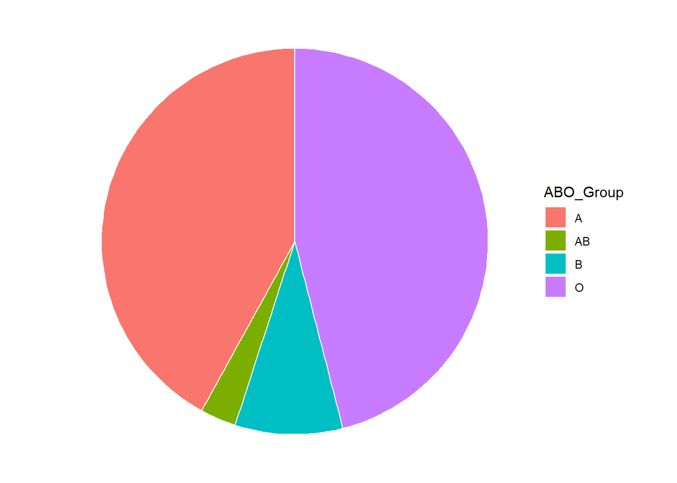
The pie chart in Figure 8.1 depicts the ABO group data. In a pie chart, each category is represented by a slice of the pie. The area of the slice is proportional to the percentage of items in the category – that is, the relative frequency multiplied by 100.

Figure 8.1: Relative Frequencies for ABO Blood Groups
Pie charts are effective for displaying the relative frequencies of a small number of categories. They are not recommended, however, when you have a large number of categories. Pie charts can also be confusing when they are used to compare the outcomes of two different surveys or experiments. In an influential book on the use of graphs, Edward Tufte asserted, “The only worse design than a pie chart is several of them.”
8.4 Bar Charts
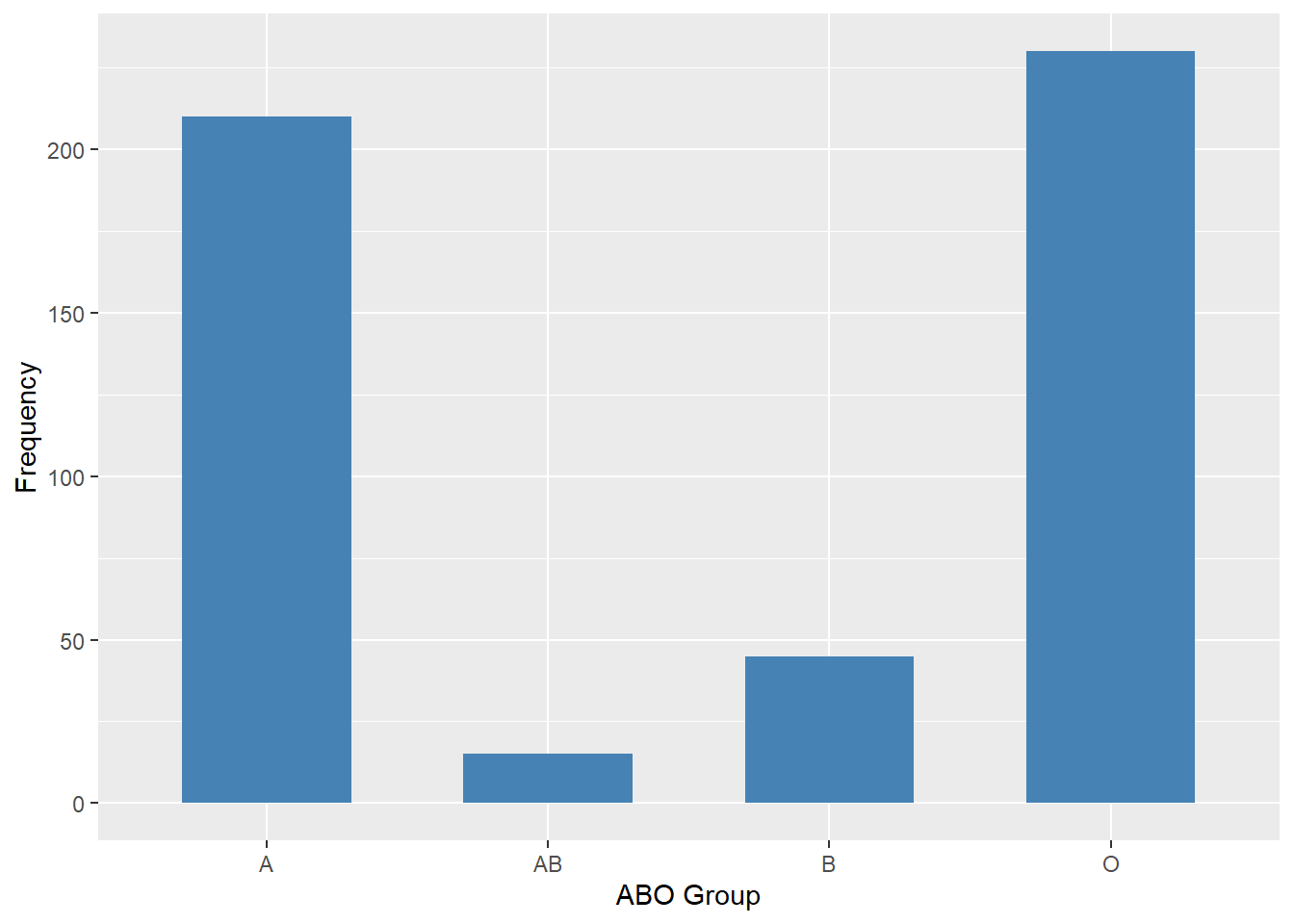
Bar charts can also be used to represent frequencies of different categories. A bar chart of the ABO frequencies is shown in Figure 8.2. Frequencies are shown on the Y-axis and the blood group is shown on the X-axis.

Figure 8.2: Frequencies for ABO Blood Groups
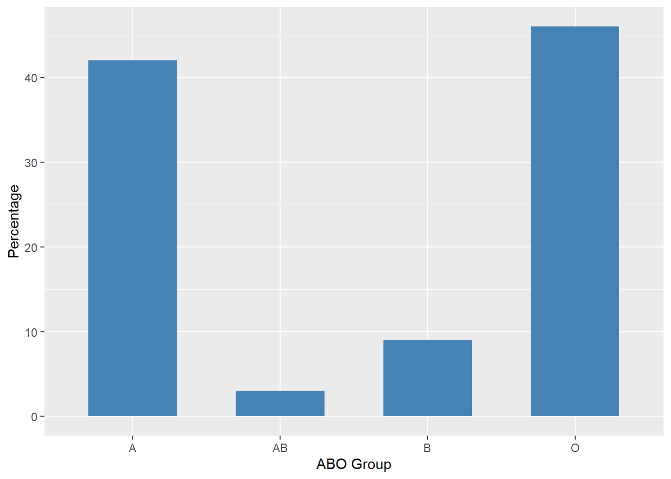
The Y-axis also can show the percentage of observations instead of the number of observations, as in Figure 8.3.

Figure 8.3: Percentages for ABO Blood Groups
8.5 Comparing Distributions
Often we need to compare different sets of data, or different subsets within the same overall data set In this case, we are comparing the “distributions” of outcomes or responses. Bar charts are often excellent for illustrating differences between two distributions. Table 8.2 shows the distribution (in percentages) of ABO blood groups for those in Albania and Australia.
| ABO Group | Albania | Australia |
|---|---|---|
| A | 36.7 | 38 |
| B | 17.1 | 10 |
| AB | 6.1 | 3 |
| O | 40.1 | 49 |
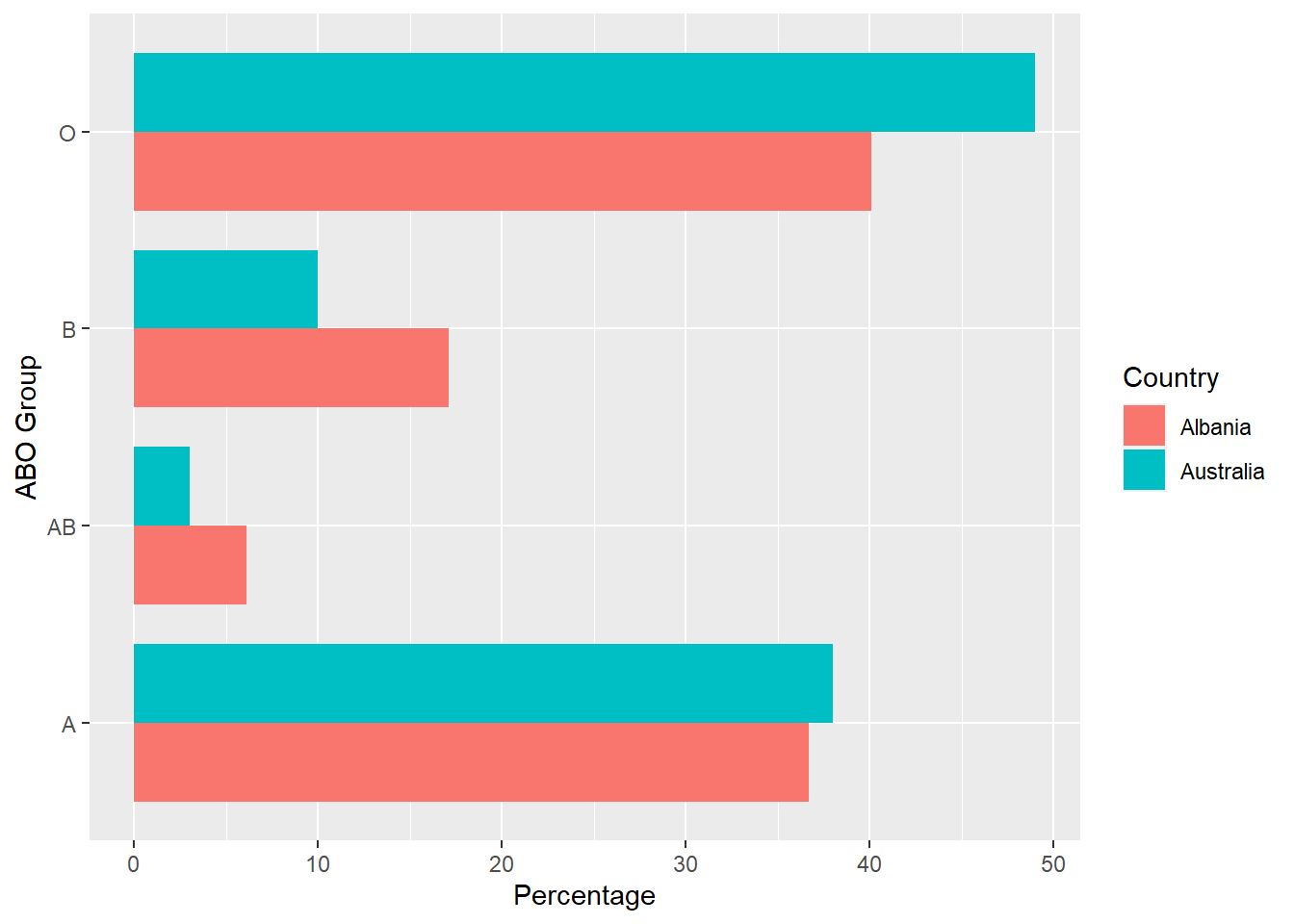
From Table 8.2 we see that ABO groups B and AB are more common in Albania, group O is more common in Australia, and group A is similar for both. This can be seen in the bar chart in Figure 8.4.

Figure 8.4: Percentages for ABO Blood Groups by Country
The bars in Figure 8.4 are oriented horizontally rather than vertically. The horizontal format is useful when you have many categories because there is more room for the category labels.
8.6 Exercises
- \(\text{Put exercises here}\)
8.7 Code Appendix
library(dplyr)
library(ggplot2)
library(tidyr)

data <- data.frame(ABO_Group = c("A", "B", "AB", "O"), value = c(210, 45, 15, 230)) %>%
  mutate(prop = value / sum(value) * 100)

# Figure 7.1 -----
ggplot(data = data, aes(x = "", y = prop, fill = ABO_Group)) +
  geom_bar(stat = "identity", width = 1, color = "white") +
  coord_polar("y", start = 0) +
  theme_void()

# Figure 7.2 -----
ggplot(data, aes(ABO_Group, value)) +
  geom_bar(stat = "identity", fill = "steelblue") +
  labs(x = "ABO Group", y = "Frequency")

# Figure 7.3 -----
ggplot(data, aes(ABO_Group, prop)) +
  geom_bar(stat = "identity", fill = "#B4464B") +
  labs(x = "ABO Group", y = "Percentage")

# Figure 7.4 -----
data <- data.frame(ABO_Group = c("A", "B", "AB", "O"),
                   Albania = c(36.7, 17.1, 6.1, 40.1),
                   Australia = c(38, 10, 3, 49)) %>%
  pivot_longer(!ABO_Group, names_to = "Country", values_to = "Percentage")

ggplot(data, aes(ABO_Group, Percentage, fill = Country)) +
  geom_bar(stat = "identity", position = "dodge", width = 0.8) +
  labs(x = "ABO Group")
  coord_flip()