Chapter 9 Graphing Distributions: Histograms
Note: Portions below draw on content from Online Statistics Education: A Multimedia Course of Study (http://onlinestatbook.com/) Project Leader: David M. Lane, Rice University
9.1 Introduction
The “distribution” of a set of data consists of the set of possible data values and the frequency that the values occur. Understanding how data is distributed is a critical component of statistics and data analysis. Visualizing data is an effective way to better understand the distribution and there are a variety of visualization methods available.
A histogram is one graphical method for displaying the shape of a distribution of quantitative data. It is useful when there are a large number of data values, providing information about the number of values in different groupings. Histograms are widely used and are fairly easy to produce with software.
9.2 Frequency Tables
We begin with an example consisting of the weights of 371 bags containing a substance suspected of being narcotics. The weights of the bags range from 215 to 270 grams. Below are the weights for 10 random bags. (There are too many values for it to be practical or useful to show them all.)
## [1] 240.91 234.66 246.84 244.24 253.39 245.07 228.75 237.29 255.69 254.64One way to get a sense of the distribution of the weights is through the use of a frequency table, where we organize the data into groups of similar weights and give the count the number in each group. The results for this data set are shown in Table 9.1.
| Interval Lower Limit | Interval Upper Limit | Class Frequency |
|---|---|---|
| 215 | 220 | 4 |
| 220 | 225 | 8 |
| 225 | 230 | 31 |
| 230 | 235 | 74 |
| 235 | 240 | 88 |
| 240 | 245 | 75 |
| 245 | 250 | 57 |
| 250 | 255 | 25 |
| 255 | 260 | 8 |
| 260 | 265 | 1 |
To create this table, the range of weights was broken into class intervals.
The first interval is from 215 to 220, the second from 220 to 225, and so on.
Next the number of weights
falling into each interval was counted to obtain the class frequencies. There are four weights
in the first interval, eight in the second, and so on.
Class intervals of width 5 provide enough detail about the distribution without making the graph too “choppy.” How one goes about choosing the widths (called bin widths) of class intervals is discussed later in this section.
9.3 Histograms
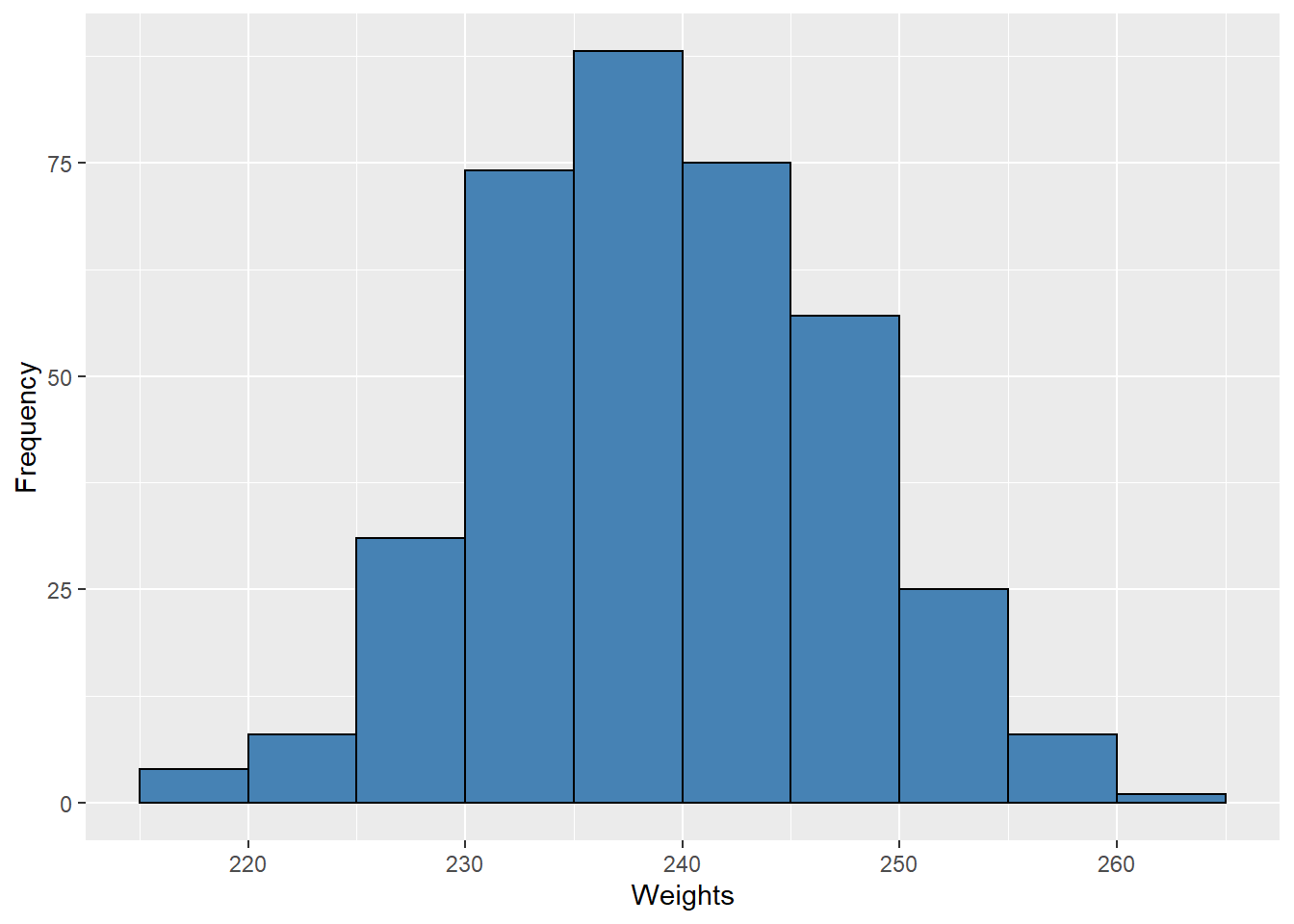
In a histogram the class frequencies are represented by bars with the height of each bar corresponds to its class frequency, providing a graphical depiction of the data. The height of each bar corresponds to its class frequency. A histogram of the weight data is shown in Figure 9.1.

Figure 9.1: Histogram of Weights
We can see from the histogram that most of the weights are between 230 and 250 grams, with fewer weights in the extremes. We can also see that the distribution is not quite symmetric, with the weights extending farther to the right than to the left. This distribution can be said to be skewed.
Because the weights are measured to two decimal places, it is not likely that we get many “fence-sitters” – that is, values that land right on the border between two bins. This allows us to choose whole numbers as boundaries, avoiding a cluttered appearance. Computer software generally will use this option when feasible, and sometimes automatically labels the middle of each interval instead of the endpoints. (Software typically allows for the user to specify bins if desired.)
Histograms can be based on relative frequencies instead of actual frequencies, showing the proportion (or percentage) of values in each interval instead of the exact frequency. Our weight data is displayed as percentages in Figure 9.2. To get the percentages, we divide each frequency by the number of data values (that gives the proportion) and then multiply by 100 to convert to percentages.

Figure 9.2: Histogram of Weights
We see that the shape of the histogram is unchanged, only the Y-axis is different.
9.4 Bin Widths
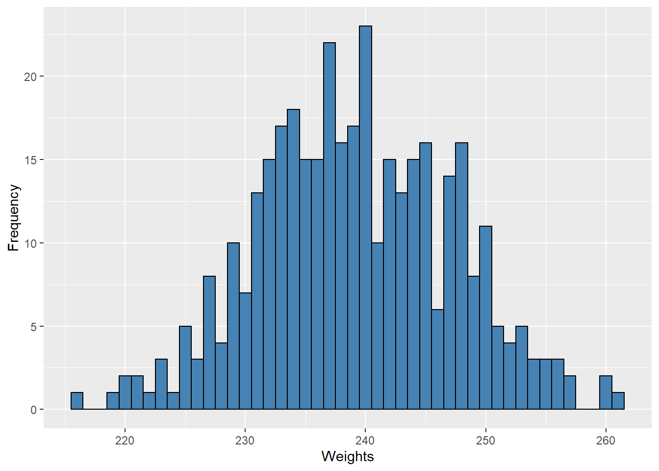
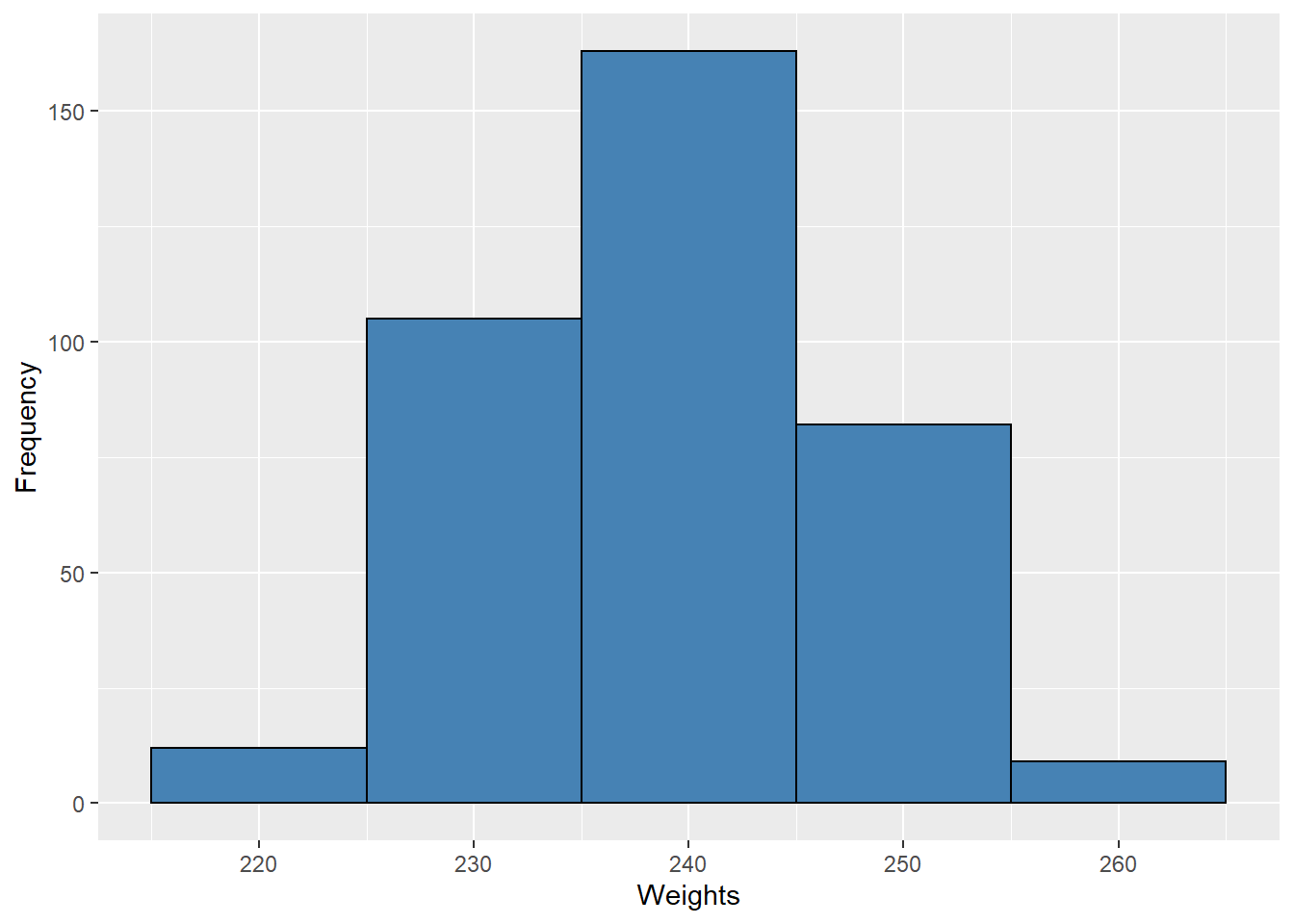
The choice of bin width determines the number of class intervals. This decision, along with the choice of starting point for the first interval, affects the shape of the histogram. In Figure 9.3 we see histograms for our data using bins of width 1 (left) and width 10 (right). These both give a general sense of the distribution, but here bins of width 1 produce a graph that is too busy while bins of width 10 produce a graph that lacks detail.


Figure 9.3: Histograms with Different Bin Widths
Most software has defaults for bin widths that might work well for a given set of data, or might not. There are some “rules of thumb” that can help guide the choice of bin width but these are just guidelines that should not be regarded as definitive, so do not feel bound to them. That said, here are a couple of general guidelines you can consider:
\(\bullet\) Sturges’ rule is to set the number of intervals as close as possible to \(1 + \log_2(N)\), where \(\log_2(N)\) is the base 2 log of the number of observations \(N\). For our data set of \(N = 371\), we have \(1 + \log_2(N) \approx 9.535\), suggesting 10 intervals which happens to match our choice.
\(\bullet\) The Rice rule suggests that the number of intervals should be the integer nearest to \(2\sqrt[3]{N},\) twice the cube root of the number of data values. For \(N = 371\) this formula gives \(2\sqrt[3]{371} \approx 14.371\), which is somewhat more than we chose.
The above rules are just a guide. You are advised to experiment with different numbers of intervals and choose the histogram that you feel best conveys the shape of the distribution.
9.5 Exercises
- \(\text{Put exercises here}\)
9.6 Code Appendix
set.seed(4)
data01 <- rnorm(371, mean = 239, sd = 8)
data01 <- data.frame(Weights = ifelse(data01 > 239, 239 + 1.1 * (data01 - 239), data01))

# Figure 8.1 -----
data01 %>% ggplot() +
  geom_histogram(aes(x = Weights), breaks = seq(215, 265, by = 5),
                 fill = "steelblue", color = "black") +
  labs(y = "Frequency")

# Figure 8.2 -----
data01 %>% ggplot() +
  geom_histogram(aes(x = Weights, y = 100 * ..count.. / sum(count)),
                 breaks = seq(215, 265, by = 5),
                 fill = "steelblue", color = "black") +
  labs(y = "Percentage")

# Figure 8.3 -----
data01 %>% ggplot() +
  geom_histogram(aes(x = Weights), binwidth = 1, fill = "steelblue", color = "black") +
  labs(y = "Frequency")

data01 %>% ggplot() +
  geom_histogram(aes(x = Weights), binwidth = 10, fill = "steelblue", color = "black") +
  labs(y = "Frequency")