Chapter 11 Graphing Distributions: Bar Charts
Note: Portions below modeled after content from Online Statistics Education: A Multimedia Course of Study (http://onlinestatbook.com/) Project Leader: David M. Lane, Rice University
In the section on qualitative variables, we saw how bar charts can be used to illustrate the frequencies (or relative frequencies) of different categories. For example, the bar chart shown in Figure 11.1 depicts the percentage of people in a population that have each of the four possible ABO blood groups.
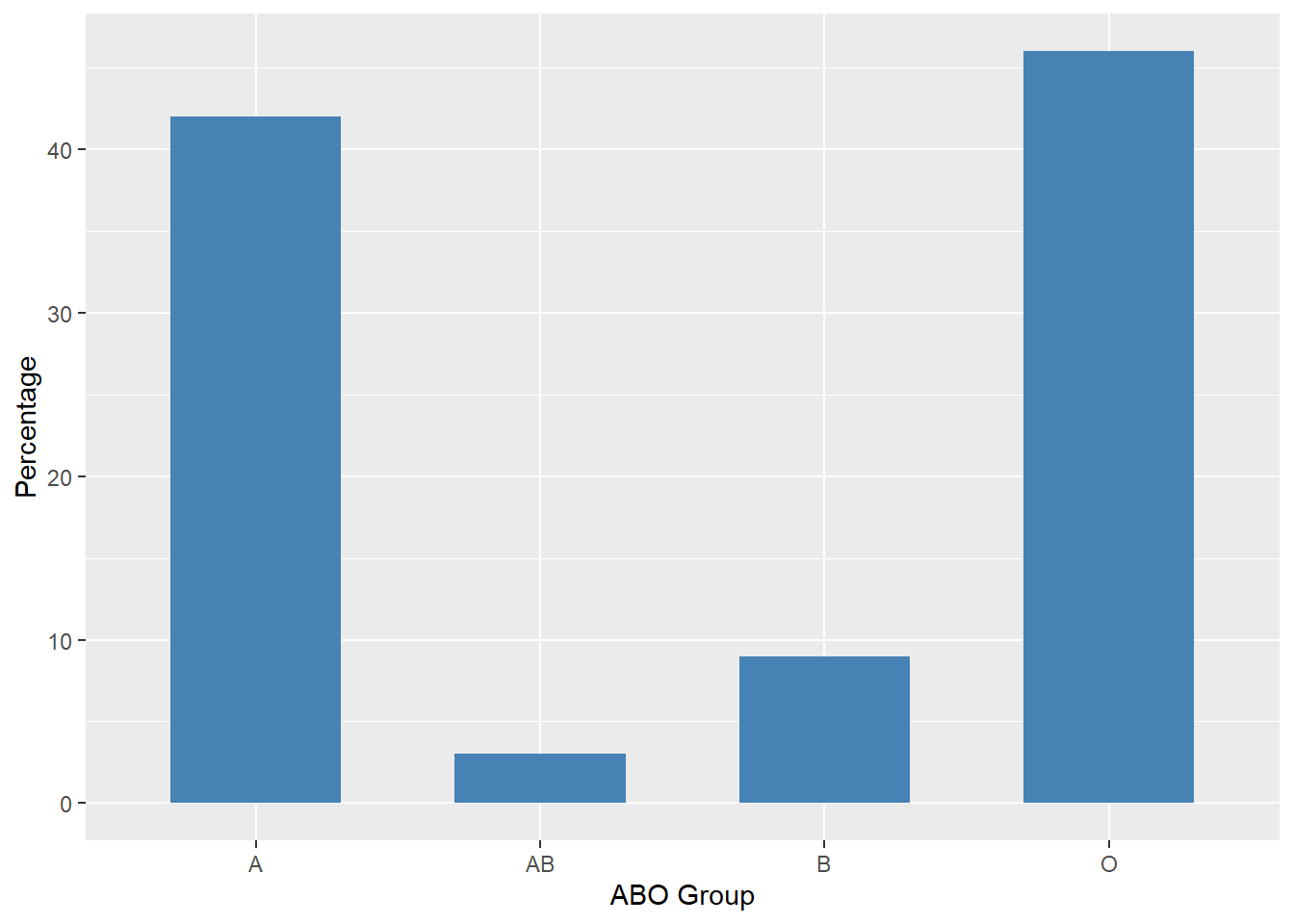
Figure 11.1: Percentages for ABO Blood Groups
In this chapter we consider how bar charts can be used to present other types of quantitative information. The bar chart in Figure 11.2 presents the number of murders in four large U.S. cities.
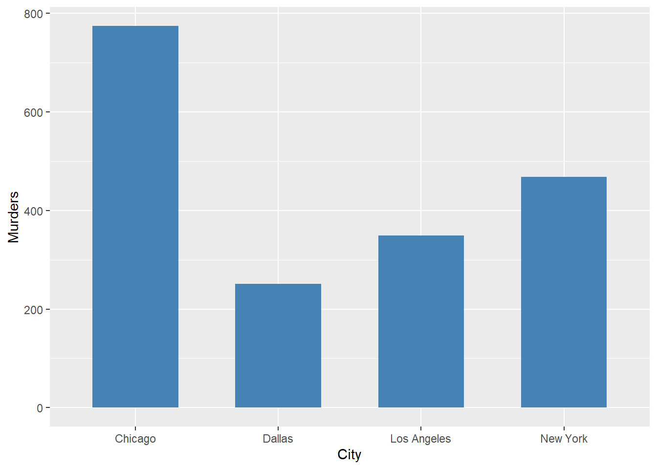
Figure 11.2: Number of murders, selected U.S. cities, year 2000
A case can be made that more relevant than the total number of murders is the per capita number of murders. Figure 11.3 gives the number of murders per 1,000,000 population for the same cities.
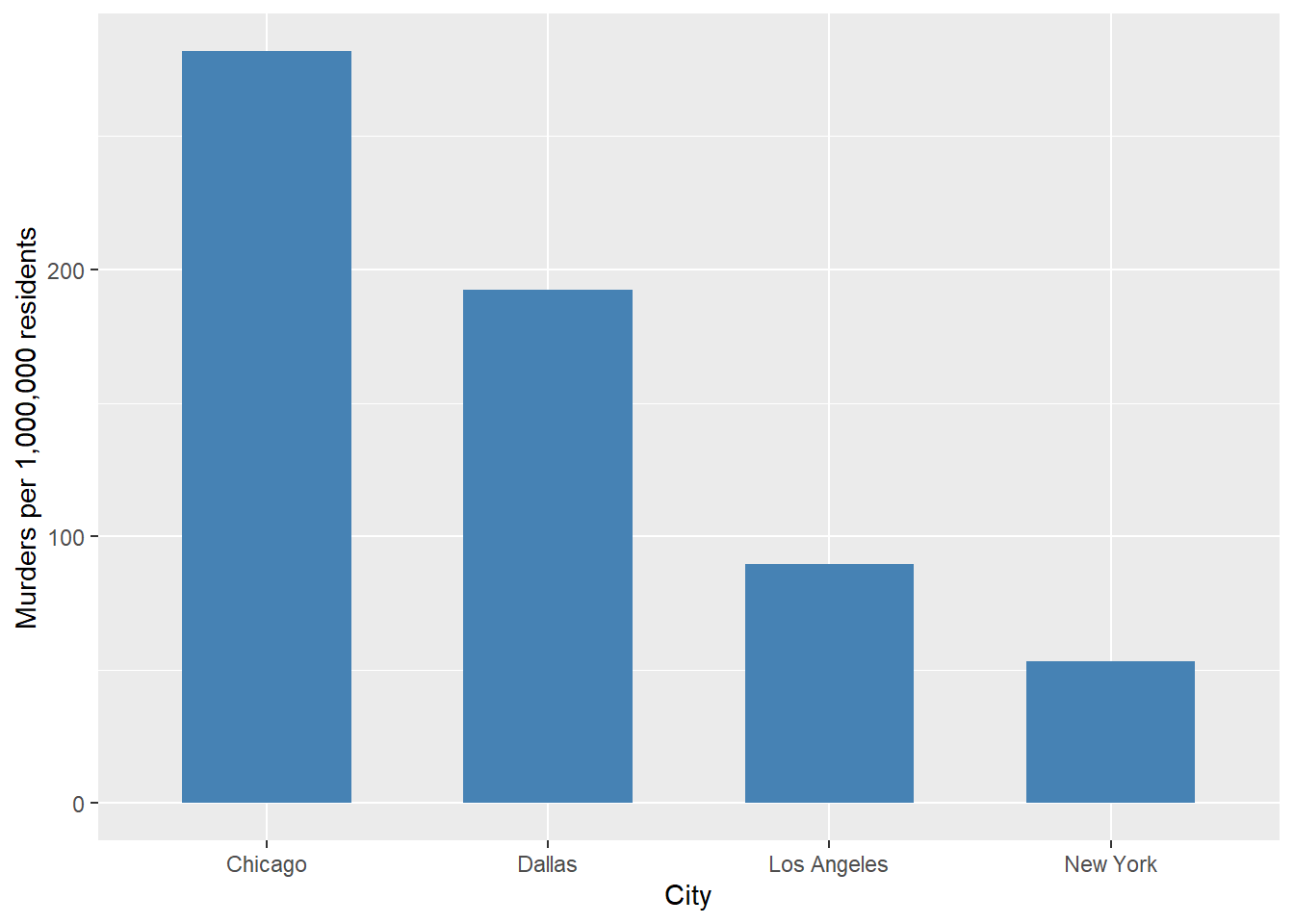
Figure 11.3: Murders per 1,000,000 residents, selected U.S. cities, year 2000
Bar charts can be useful for showing change over time. Figure 11.4, shows the year-to-year percent change in the number of shootings in the city of Toronto. The considerable variation from one year to the next is clear. Note also that negative percentages are possible, the result of the number of shootings decreasing from one year to the next.
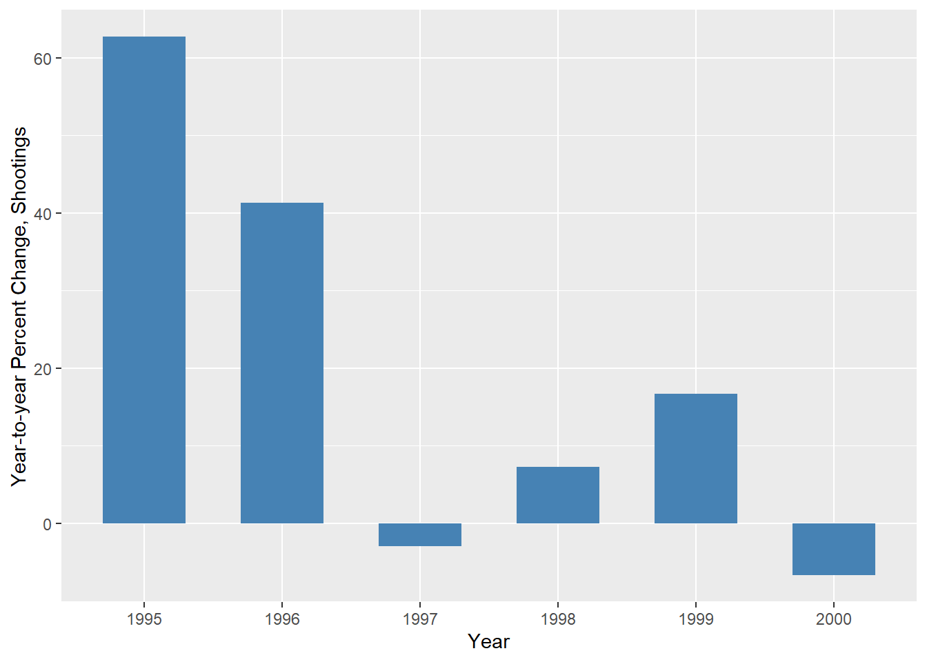
Figure 11.4: Year-to-year Percent Change, Shootings in Toronto
Bar charts are often used to compare the means of different experimental conditions. Figure 11.5 shows the mean trace element measurement for collections of glass pieces found at a crime scene and in the car trunk of a suspect. (This data is treated more thoroughly in the chapter on box plots.)
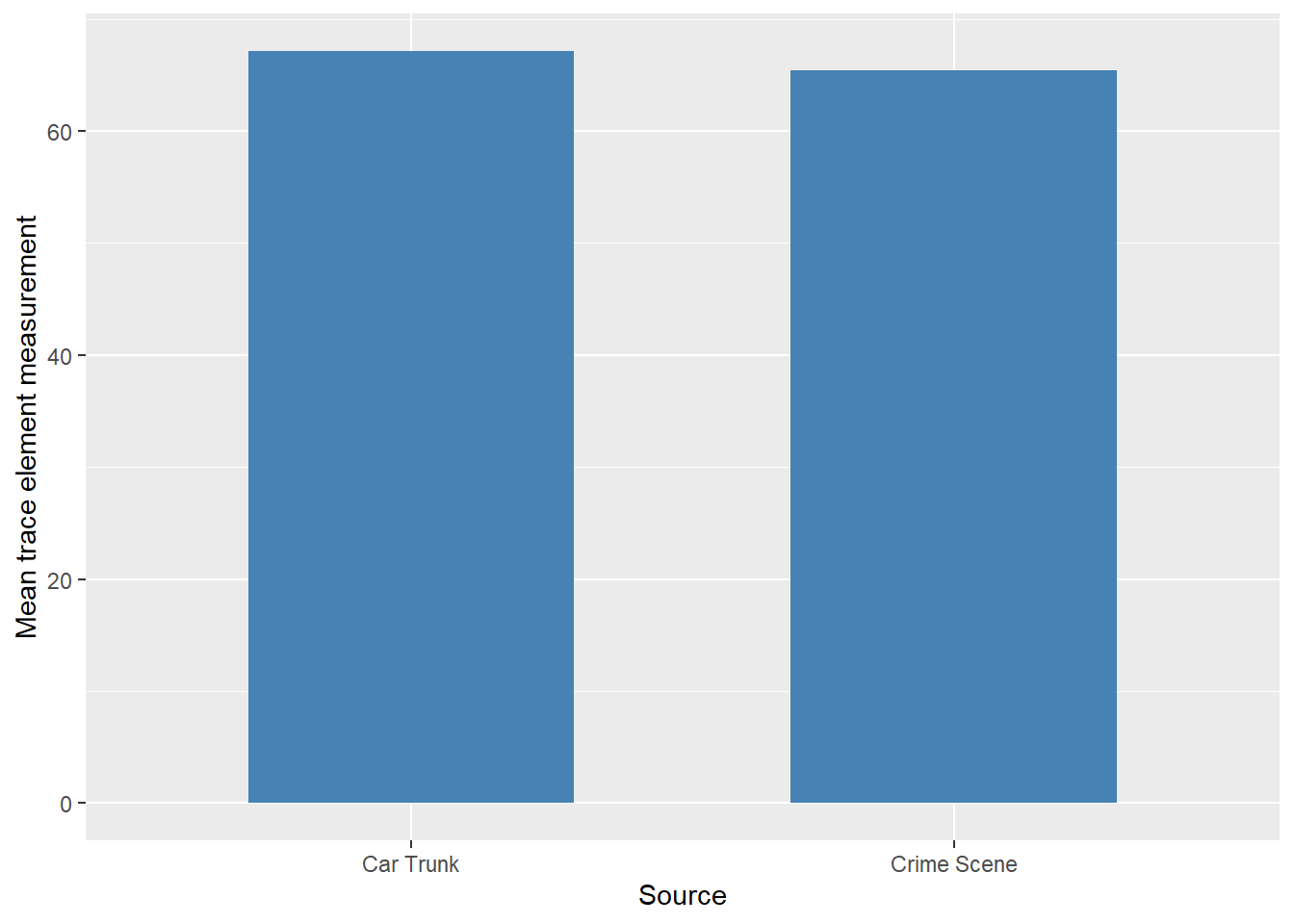
Figure 11.5: Comparison of mean trace element measurements
The heights of the bars are very similar, suggesting that there might be a common source for the two sets of glass pieces. That might well be the case but the means alone are not enough to provide a conclusion one way or the other. In this case, box plots can be used instead since they provide more information about the distribution. Figure 11.6 shows the box plots for this data again.
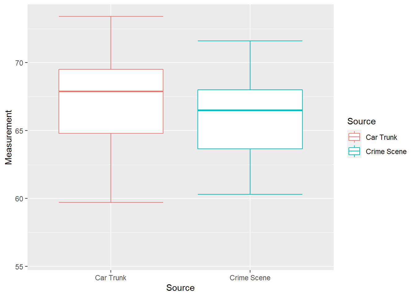
Figure 11.6: Box plots of glass measurements
The box plots have considerable overlap, but at the same time the middle 50% of values from the car trunk seem to trend higher than those from the crime scene. This suggests the possibility of different sources for the two sets of glass pieces while not ruling out the possibility of them coming from the same source. We will consider this question more in later chapters.
11.1 Exercises
- \(\text{Put exercises here}\)
11.2 Code Appendix
# Figure 10.1 -----
data <- data.frame(ABO_Group = c("A", "B", "AB", "O"), value = c(210, 45, 15, 230)) %>%
  mutate(prop = value / sum(value) * 100)

ggplot(data, aes(ABO_Group, prop)) +
  geom_bar(stat = "identity", fill = "steelblue", width = 0.6) +
  labs(x = "ABO Group", y = "Percentage")

# Figure 10.2 -----
data <- data.frame(City = c("Chicago", "Dallas", "Los Angeles", "New York"),
                   Murders = c(774, 251, 349, 468))

ggplot(data, aes(City, Murders)) +
  geom_bar(stat = "identity", fill = "steelblue", width = 0.6) +
  labs(x = "City", y = "Murders")

# Figure 10.3 -----
data <- data.frame(City = c("Chicago", "Dallas", "Los Angeles", "New York"),
                   Murders = c(281.8645, 192.4847, 89.51013, 53.15766))

ggplot(data, aes(City, Murders)) +
  geom_bar(stat = "identity", fill = "steelblue", width = 0.6) +
  labs(x = "City", y = "Murders per 1,000,000 residents")

# Figure 10.4 -----
data <- data.frame(City = c("1995", "1996", "1997", "1998", "1999", "2000"),
                   RateChange = c(62.7, 41.3, -2.9, 7.3, 16.7, -6.7))

# 2014-2020: 177, 288, 407, 395, 424, 495, 462 Shootings in Toronto (Wikipedia)

ggplot(data, aes(City, RateChange)) +
  geom_bar(stat = "identity", fill = "steelblue", width = 0.6) +
  labs(x = "Year", y = "Year-to-year Percent Change, Shootings")

# Figure 10.5 -----
data01 = c(55.6, 65.6, 68.0, 68.9, 67.7, 66.5, 66.8, 60.3, 68.0, 71.6, 61.4, 63.2, 68.2, 64.1, 64.8)
data02 = c(67.9, 68.9, 69.5, 67.6, 73.4, 64.5, 73.0, 59.7, 66.9, 68.2, 71.8, 64.8, 56.3)
data <- data.frame(Source = c("Car Trunk", "Crime Scene"),
                   Mean = c(mean(data02), mean(data01)))

ggplot(data, aes(Source, Mean)) +
  geom_bar(stat = "identity", fill = "steelblue", width = 0.6) +
  labs(x = "Source", y = "Mean trace element measurement")

# Figure 10.6 -----
data01 <- data.frame(Measurement = data01, Source = "Crime Scene")
data02 <- data.frame(Measurement = data02, Source = "Car Trunk")
data03 = rbind(data01, data02)

ggplot(data03, aes(x=Source, y=Measurement, color=Source)) +
  stat_boxplot(geom = "errorbar") + geom_boxplot(outlier.shape = NA)