Chapter 10 Graphing Distributions: Box Plots
Note: Portions below modeled after content from Online Statistics Education: A Multimedia Course of Study (http://onlinestatbook.com/) Project Leader: David M. Lane, Rice University
10.1 Basic box plots
In this chapter we discuss the box plot which provides a useful way to graphically display information about the distribution of a set of data, identify outliers, and compare distributions.
To get us started, suppose that we have small pieces of glass from two different sources: a broken window at the scene of a burglary and the trunk of a car belonging to a suspect. To compare the glass from the two sources, a trace element present in glass can be measured. The amount present varies within a sheet of glass so measurements are taken from numerous pieces found at the crime scene and in the car trunk. (The specifics of the element and measurement units are not important for this discussion.) The measurements are given below:
Car Trunk:
## [1] 67.9 68.9 69.5 67.6 73.4 64.5 73.0 59.7 66.9 68.2 71.8 64.8 56.3Crime Scene:
## [1] 55.6 65.6 68.0 68.9 67.7 66.5 66.8 60.3 68.0 71.6 61.4 63.2 68.2 64.1 64.8To construct the box plot, we start by finding the 25th, 50th, and 75th percentiles for each of our data sets. Recall that the 25th percentile is the quantity such that 25% of the data values are less than this quantity, and similarly for the other percentiles. The percentiles for each of our data sets are shown in Table 10.1.
| Percentile | Car Trunk | Crime Scene |
|---|---|---|
| \(25^{th}\) | 64.8 | 63.65 |
| \(50^{th}\) | 67.9 | 66.50 |
| \(75^{th}\) | 69.5 | 68.00 |
Figure 10.1 shows how these percentiles are incorporated into box plots. The lower and upper limits of the box (called “hinges”) extend from the 25th to 75th percentile and a line between those at the 50th percentile (which is the median).
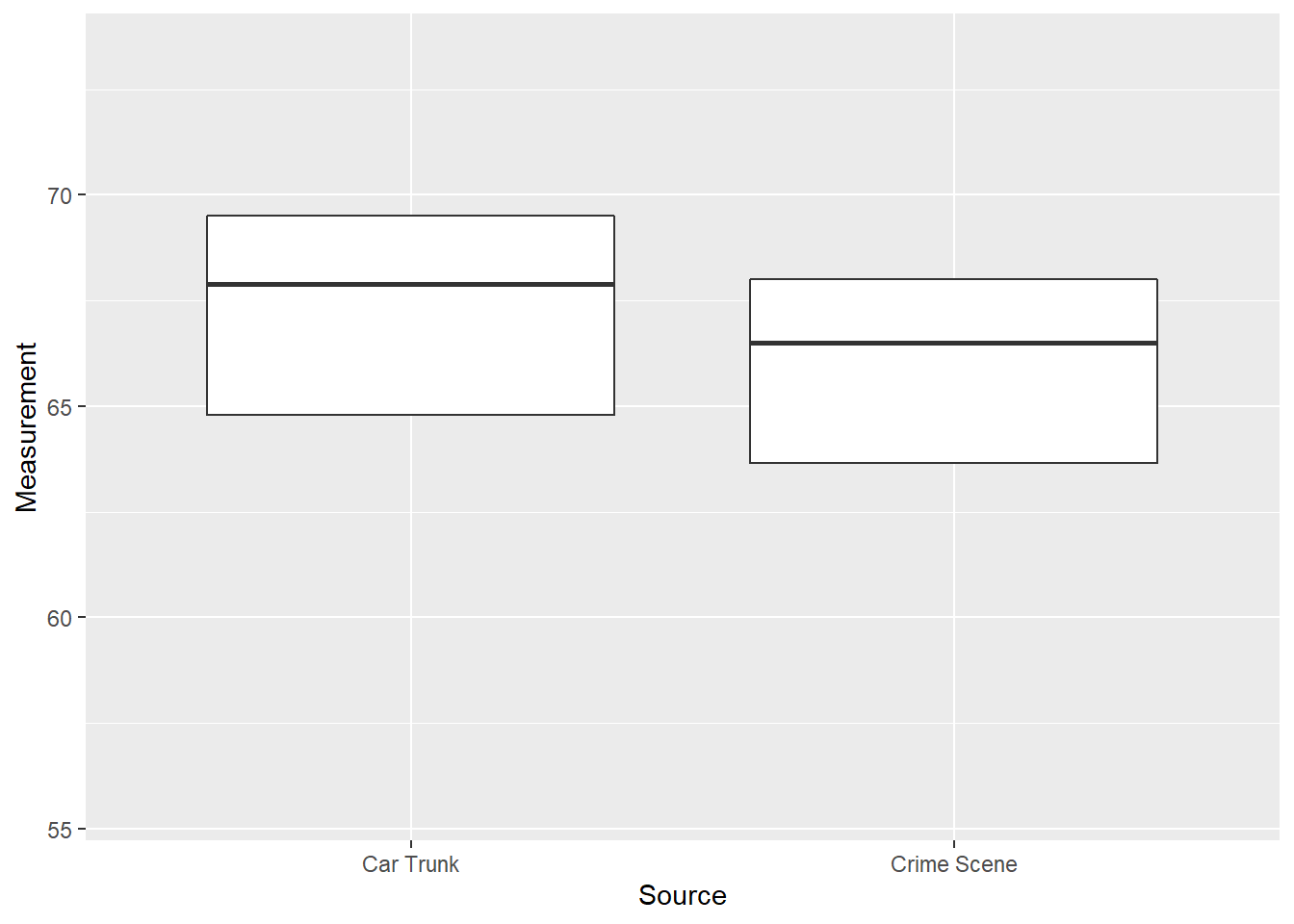
Figure 10.1: Box Plots of Glass Measurements
Comparing box plots, we see that the percentiles for the car trunk data are somewhat greater than for the crime scene data but there is considerable overlap between them. Based on this, it is difficult to say whether the glass pieces from car trunk and crime scene are from the same original source or different sources.
Most box plots have more information than that shown in Figure 10.1 and there are a wide variety of options that can be included. We give a few examples below to provide a sense of what is possible but these are by no means comprehensive.
We next add “whiskers” above and below each box to give additional information about the spread of the data. Whiskers are vertical lines that (optionally) end in a horizontal stroke. Define the “step” to be 1.5 times the IQR = 75th percentile - 25th percentile (IQR = “Interquartile range”). The upper whisker extends from the upper hinge to the greatest data value that is less than one “step” above the upper hinge, with the lower whisker similarly defined. (Software automates the process so one need not do this by hand.)
Figure 10.2 shows the box plots with whiskers.
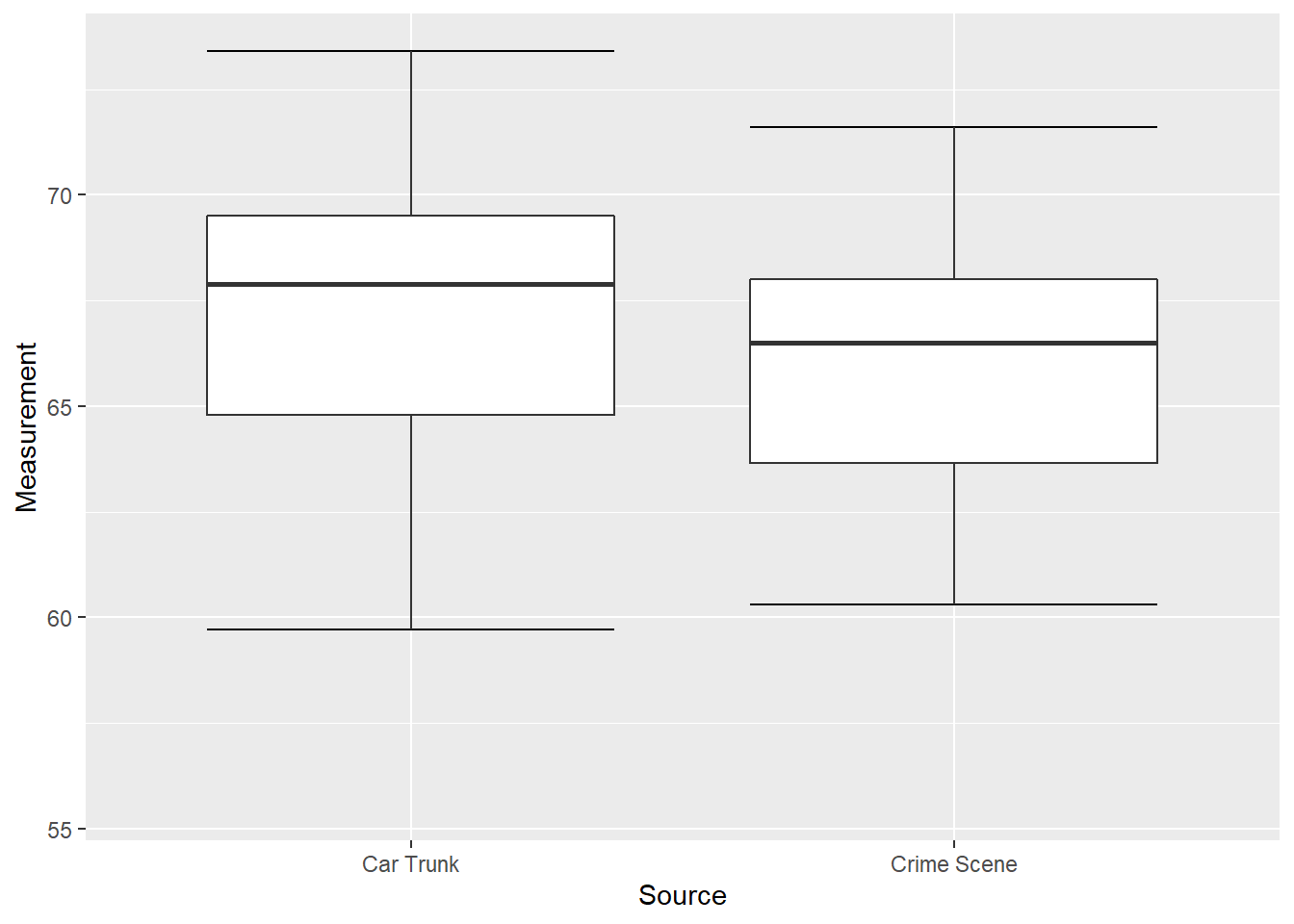
Figure 10.2: Box Plots of Glass Measurements
The whiskers add additional information about the spread of data, but do not extend to all values. We indicate these with dots that are beyond the whiskers in positions corresponding to data values. This is shown in Figure 10.3.
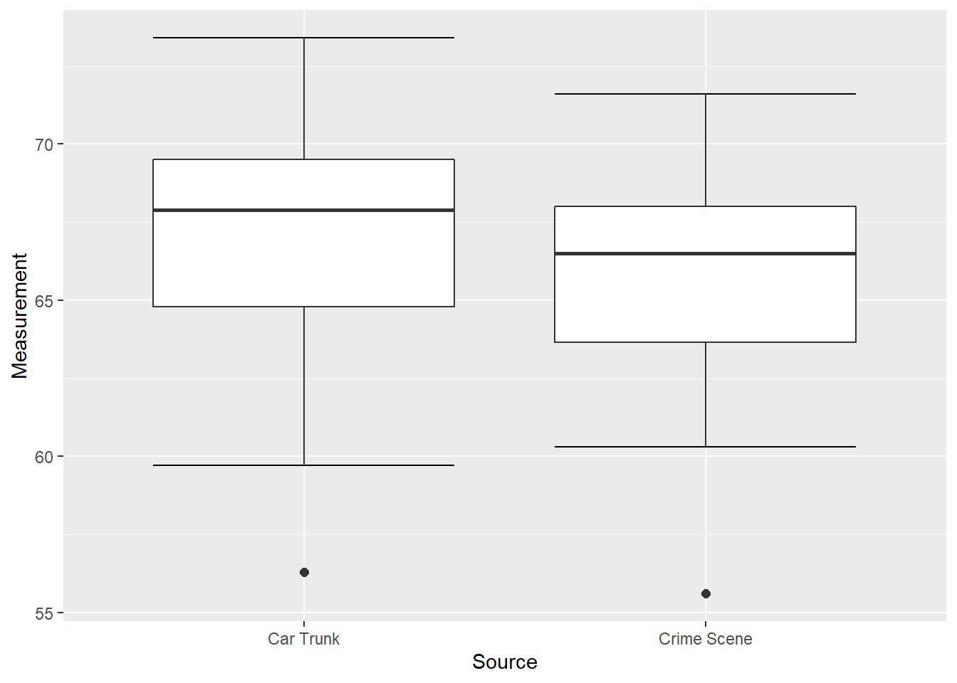
Figure 10.3: Box Plots of Glass Measurements
Some (but not all!) box plots also include a mark indicating the location of the mean. This is added in Figure 10.4 as a red dot in each box plot.
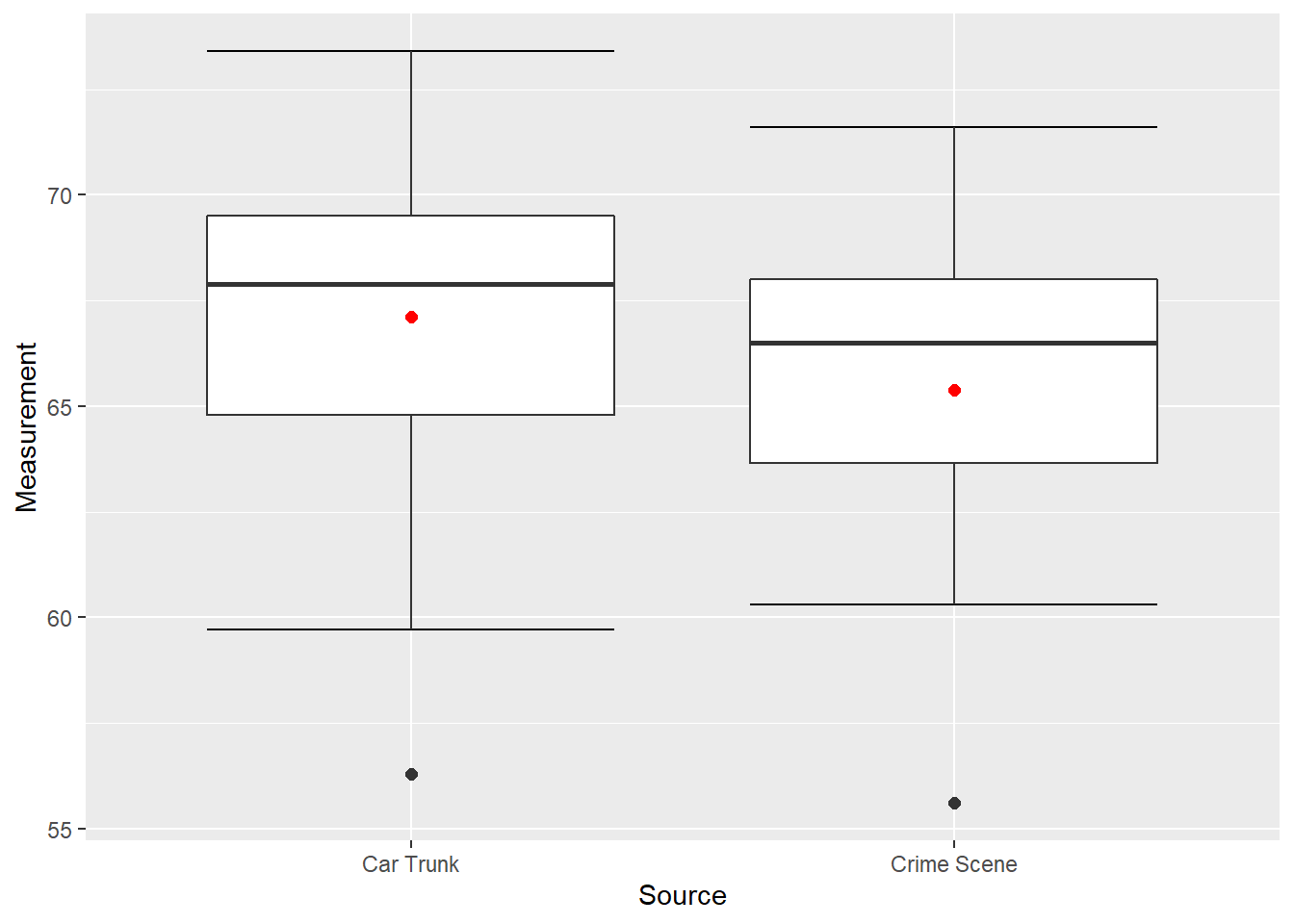
Figure 10.4: Box Plots of Glass Measurements
Figure 10.4 provides a good summary of the data. Half of the scores in a distribution are between the hinges (recall that the hinges are the 25th and 75th percentiles), we see that half the measurements for the glass from the car trunk are between about 65 and 69, while the measurements from the crime scene are between about 63.5 and 68. The IQR for each is about the same but the overall range for the car trunk measurements is somewhat greater then the crime scene measurements. For both data sets the mean is less than the median, which is to be expected due to the extreme small values displayed in Figure 10.4.
10.2 Variations on box plots
Statistical analysis programs typically offer numerous options for creating box plots. For instance, Figure 10.5 shows the box plots as above but also includes the individual measurements along the vertical axis. (The means are still red to distinguish it from the data values.) This provides more detail on our data – note the points that specify the ends of the whiskers as well as the difference in how the points are distributed within the boxes.
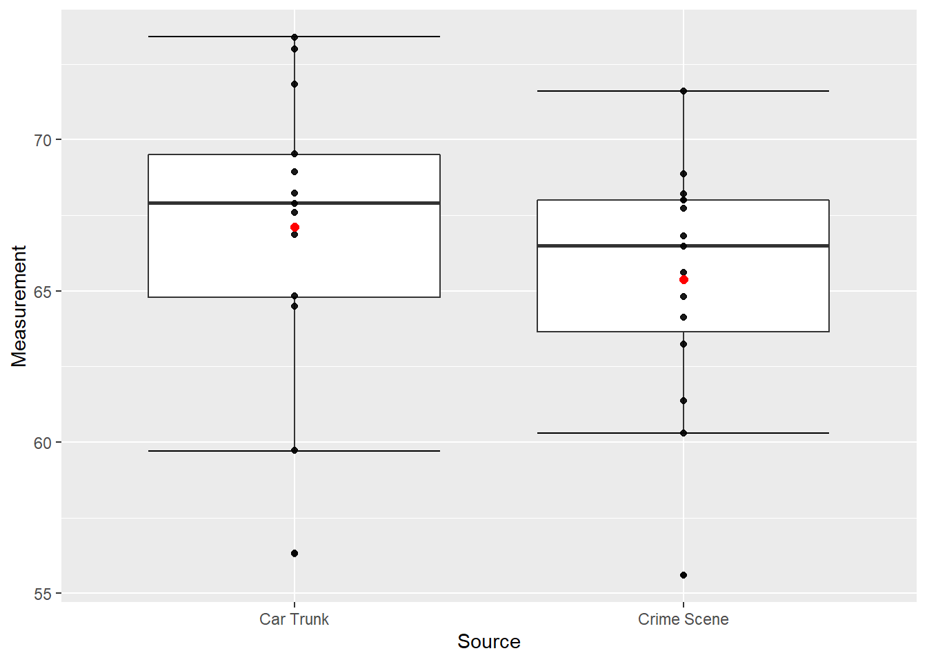
Figure 10.5: Box Plots of Glass Measurements
Showing the specific data values on the vertical axis works well as long as there are not too many points and they do not tend to stack on top of each other. In the case of more points and more repetition of values, an option that can work is “jittering” which adds a horizontal offset so that points can be distinguished. Figure 10.6 shows our data with a modest amount of jitter added.
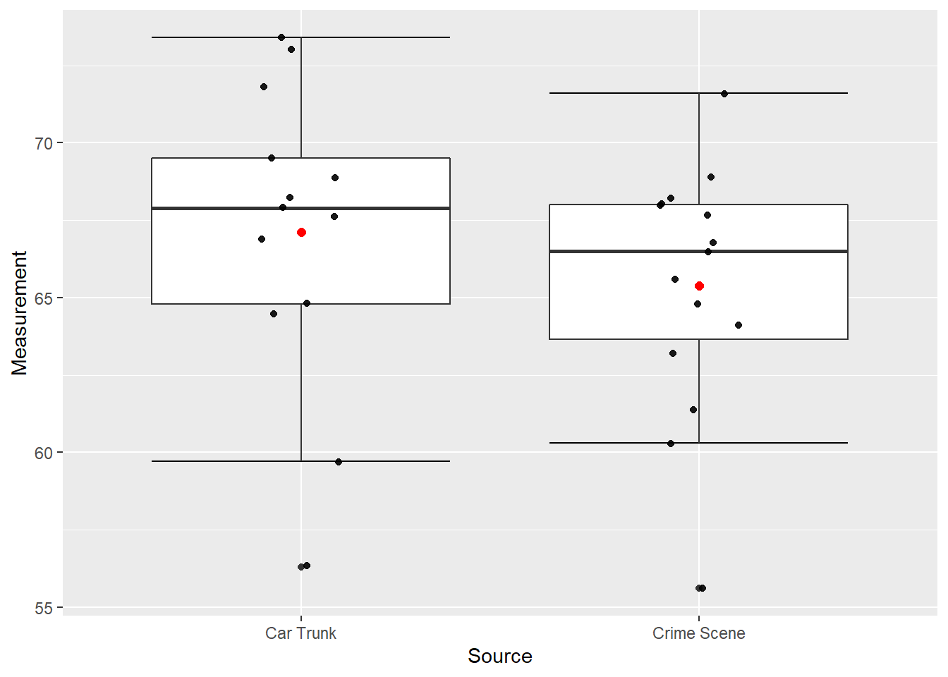
Figure 10.6: Box Plots of Glass Measurements
Different styles of box plots are best for different situations, and there are no firm rules for which to use. When exploring your data, you should try several ways of visualizing them. Which graphs you include in your report should depend on how well different graphs reveal the aspects of the data you consider most important.
10.3 Exercises
- \(\text{Put exercises here}\)
10.4 Code Appendix
data01 <- c(55.6, 65.6, 68.0, 68.9, 67.7, 66.5, 66.8, 60.3, 68.0, 71.6, 61.4, 63.2, 68.2, 64.1, 64.8)
data02 <- c(67.9, 68.9, 69.5, 67.6, 73.4, 64.5, 73.0, 59.7, 66.9, 68.2, 71.8, 64.8, 56.3)

data01 <- data.frame(Measurement = data01, Source = "Crime Scene")
data02 <- data.frame(Measurement = data02, Source = "Car Trunk")
data03 <- rbind(data01, data02)

# Figure 9.1 -----
data03 %>% ggplot(aes(x = Source, y = Measurement)) +
  geom_boxplot(outlier.shape = NA, coef = 0)

# Figure 9.2 -----
data03 %>% ggplot(aes(x = Source, y = Measurement)) + stat_boxplot(geom = "errorbar") +
  geom_boxplot(outlier.shape = NA)

# Figure 9.3 -----
data03 %>% ggplot(aes(x = Source, y = Measurement)) + stat_boxplot(geom = "errorbar") +
  geom_boxplot()

# Figure 9.4 -----
data03 %>% ggplot(aes(x = Source, y = Measurement)) + stat_boxplot(geom = "errorbar") +
  geom_boxplot(outlier.size = 2) +
  stat_summary(fun = mean, geom = "point", color = "red", size = 2)

# Figure 9.5 -----
data03 %>% ggplot(aes(x = Source, y = Measurement)) + stat_boxplot(geom = "errorbar") +
  geom_boxplot() + geom_jitter(width = 0, alpha = 0.9) +
  stat_summary(fun = mean, geom = "point", color = "red", size = 2)

# Figure 9.6 -----
data03 %>% ggplot(aes(x = Source, y = Measurement)) + stat_boxplot(geom = "errorbar") +
  geom_boxplot() + geom_jitter(width = 0.1, alpha = 0.9) +
  stat_summary(fun = mean, geom = "point", color = "red", size = 2)